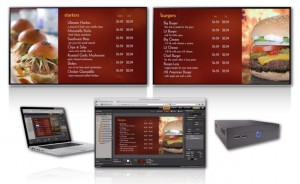
Christa Hoyland noted in a recent article for QSRWeb that “50% of consumers polled by QSRWeb say that menu boards have become harder to read and that speed of service is taking a hit as a result.” This is the last thing you want when operating a fast food – quick service restaurant. It is a pretty easy formula, a quicker turnaround means greater efficiency → more patrons served → more dollars in your pocket. Unfortunately, menu board development and its execution are often afterthoughts when looking at a restaurant’s branding as a whole, when in fact they should be at the forefront. There is no other area of any restaurant where you have the onlookers at your fingertips, fixated by their need for information. This notion of “captive audience” is at the 101 level of running a restaurant. However, trying to capitalize on this knowledge is where many get themselves in to trouble… many times without even realizing it.
Although there are several areas that people can shore up their menu boards, we are going to touch on the 3 main issues that seem to keep rearing their ugly heads.
Issue #1 – There are too many menu offerings
We have seen a recent increase in the complexity of the menu boards, as QSRs are trying to list every item they offer. The more choices, the more time it takes a customer to place an order. The idea of having “catchy” names for your *sandwiches is a cool idea, but all it does is slow down the ordering process. For instance, instead of naming 15-25 (yes 25!) different sandwiches, select 3-5 signature sandwiches that you would like to highlight and the rest can be ordered in a “build-your-own” type fashion, where there is a cost for the meat, per topping, type of bread, etc. Voilà, you have just widdled down from three menu boards to one.
*Sandwiches were used as an example. We see this frequently with pizzerias, smoothie shops, burger joints, etc.
Issue #2 – Menu options are not organized appropriately
When menu items are not organized appropriately, customers get confused and must take extra time to sort through all the options. This makes customers feel uneasy and uncomfortable because they are holding up the line, creating a negative customer experience while further impacting speed of service. Think of your 3 course meals – you have your starters and appetizers, the main course and dessert. Now consider the way you are reading this blog, or any article or book since the dawn of time – LEFT to RIGHT. Quite simply, this is the natural progression for your eyes. Misplacing an appetizer like chicken wings under the chicken area of your menu board will serve no purpose than to compel someone to buy a lower ticket item for dinner.
In its easiest form, consider your customers mental checklist… “What am I going to have first (appetizer)? What am I going to have second (meal)? What am I going to have last (dessert)?” By following this suggestion, your menu copy will essentially lay out itself.
Issue #3 – Menu offerings don’t match the POS and other customer-facing media
If menu offerings do not align with the POS and other customer-facing media, customers will ask for something using the wrong name/terminology. Employees must then spend time trying to translate the customers’ choices before placing the order, further increasing the turnaround time of each order. Despite newer POS systems having evolved to make price changes as easy as possible, that only addresses one side of the counter. Unless you are using a USER FRIENDLY digital menu board system, making changes to coincide with an increase or decrease in price is either difficult (you’re using a permanent menu board), time consuming (waiting on a reprint) and/or doesn’t look good (strips and digits). Although it may be difficult to forecast a sudden spike or fall in pricing from your vendors, you should do your best to prepare yourselves to be able to make the POS and menu board changes in unison. Selecting a menu board system that will give you the look you want with the flexibility you need will position you well for these instances in the future.
Bonus Issues to Keep in mind:
- The font size is too small resulting in legibility issues
- Pictures, or lack thereof – not representative of the offerings and/or the item shown does not draw you to that area of the menu (i.e. a picture of a burger on your appetizers panel)
- Lack of brand cohesiveness between the menu boards and wall dressings all the way through to your website
To Summarize
Here is a review of the main points of this blog post:
- Three main issues of a poorly designed menu board include the fact that there are too many menu offerings, menu options are not organized appropriately, and menu offerings don’t match the POS and other customer-facing media, all negatively affecting speed of service.
- These issues can be solved by organizing what is most important to customers in an easy-to-navigate fashion. How can this be determined? By listening to the kinds of questions customers ask when placing their orders! Are most customers asking questions about price? Calories? Sides available? Combo meals? Taking note of the answers to these questions will guide you along the path to clarity and straightforwardness for your customers.
- It is wise to utilize a company with industry knowledge and an expertise in restaurant signage to help you develop the right menu board solution to best meet your customers’ needs.
